
CLIENT: FOCUS BRANDS
MY ROLE: DESIGNER/ACD
CD: LANCE REED
FIRM: SRG
MY ROLE: DESIGNER/ACD
CD: LANCE REED
FIRM: SRG
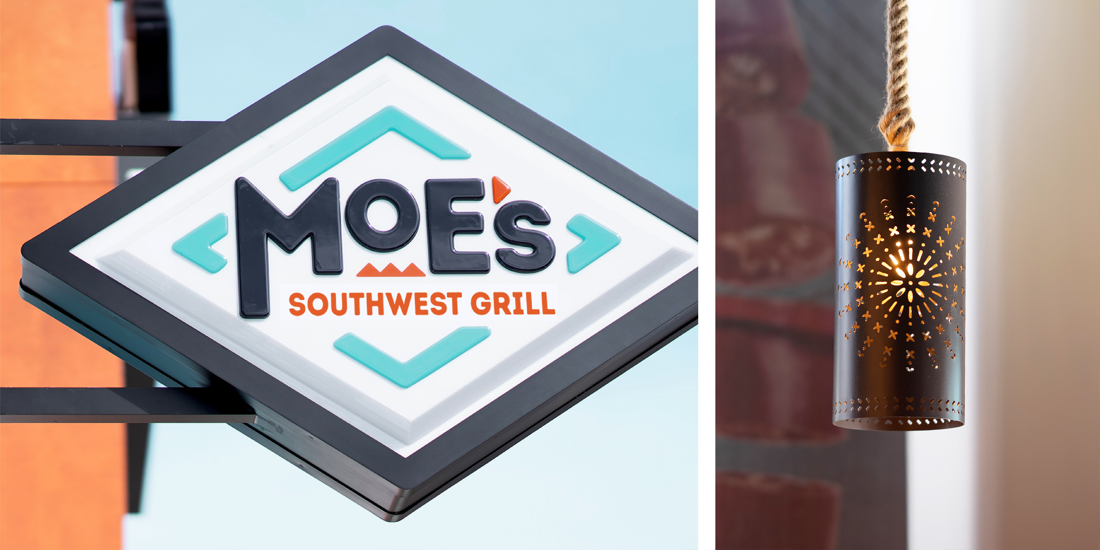
Lost in the chronically crowded world of fast casual, Moe’s needed to claim its corner in the Tex-Mex and Mexican category. With a new brand vision and menu strategy around the idea of the “Untamed Southwest,” Moe’s needed a fresh brand identity and store experience. Before any design work, my initial approach was to do a deep dive into the culture and symbols of the southwest to inspire ideas to articulate the new brand vision. One of my designs, shown below, was selected for implementation in 2018.
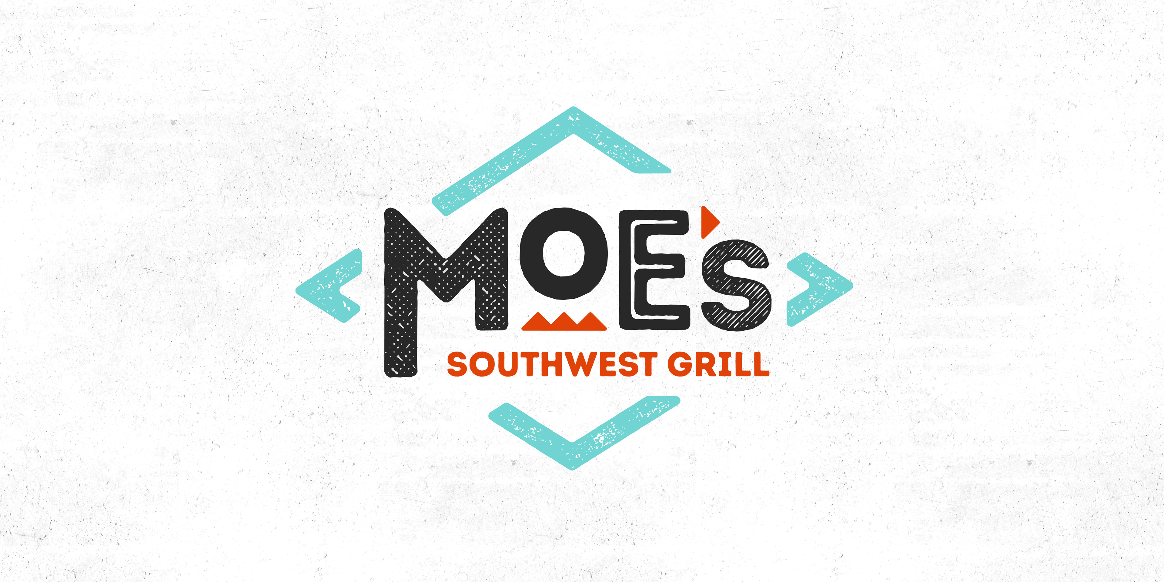
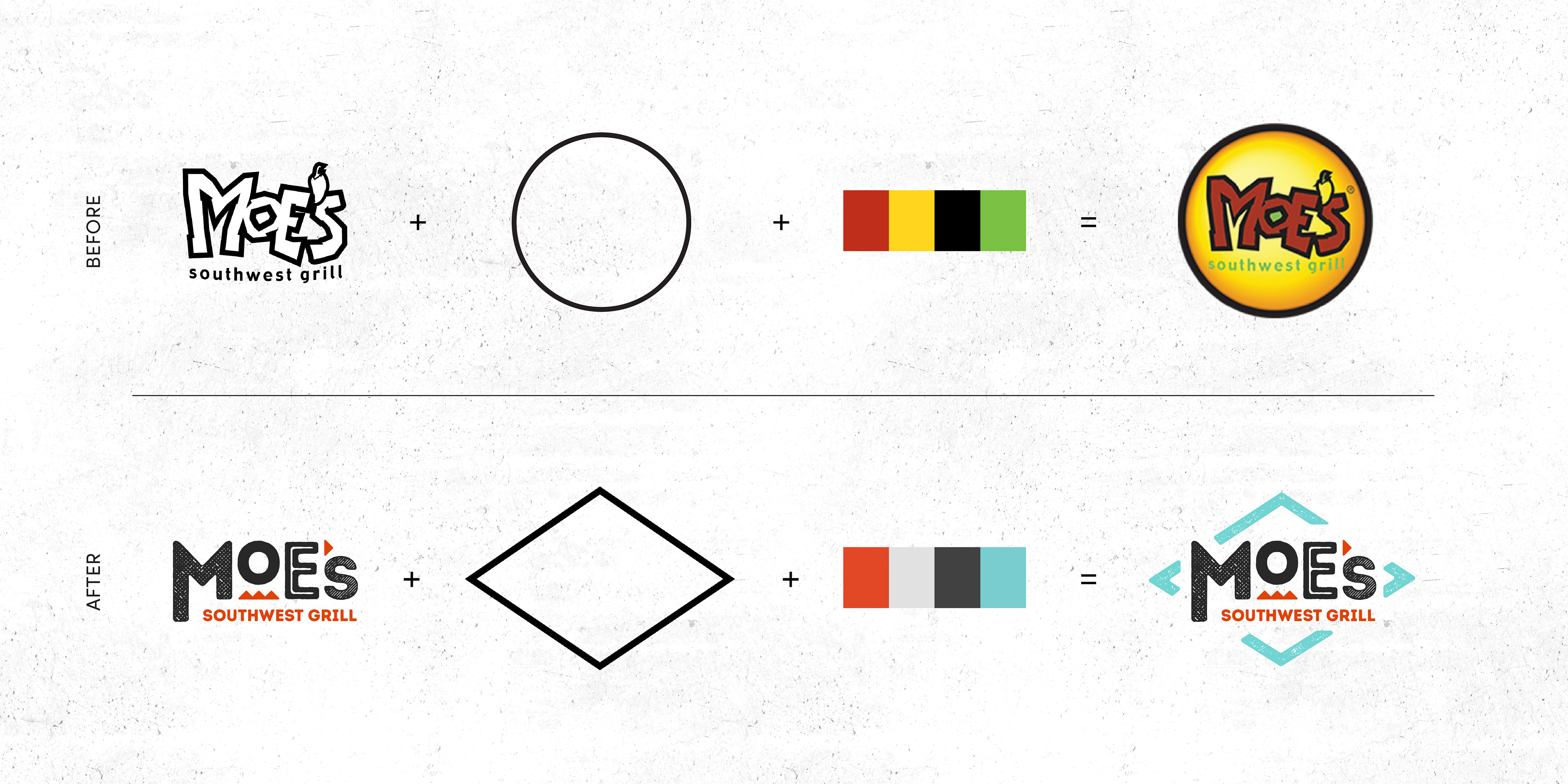
I used a diamond as the framing device for the new wordmark as it’s a geometric motif rooted in Southwest culture. The bold, geometric letterforms with various textures and sizes break out of the diamond to convey the untamed spirit of the brand. As illustrated below, even though the evolved logo was a significant change, it didn't stray entirely from the original logo framework.
It did so only in intentional and strategic ways.
It did so only in intentional and strategic ways.
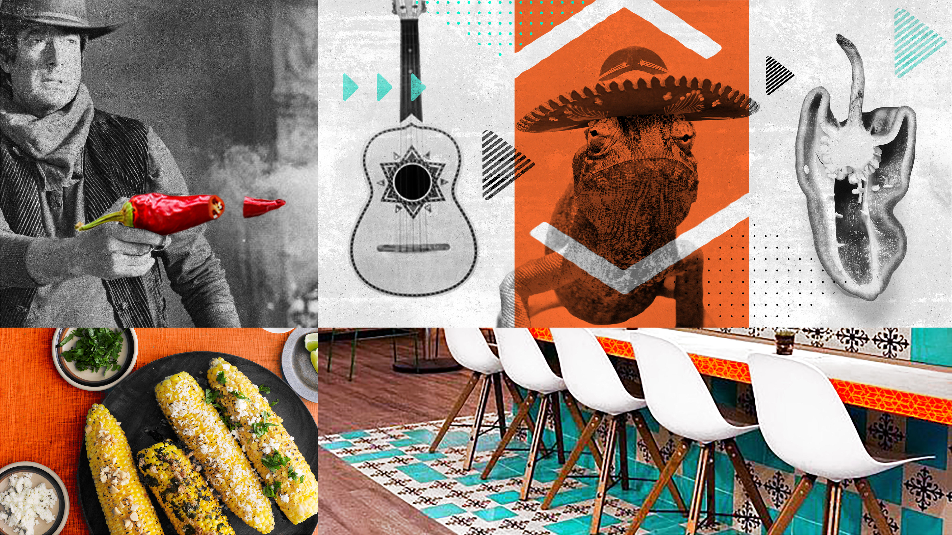
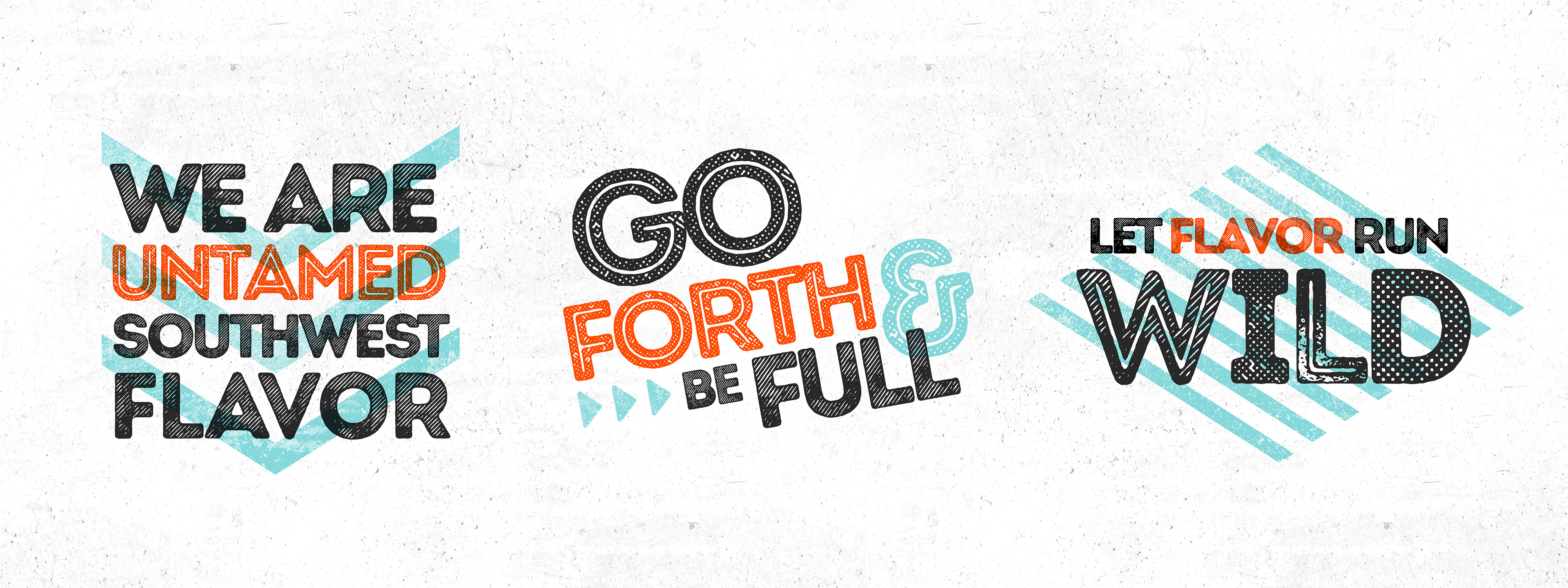
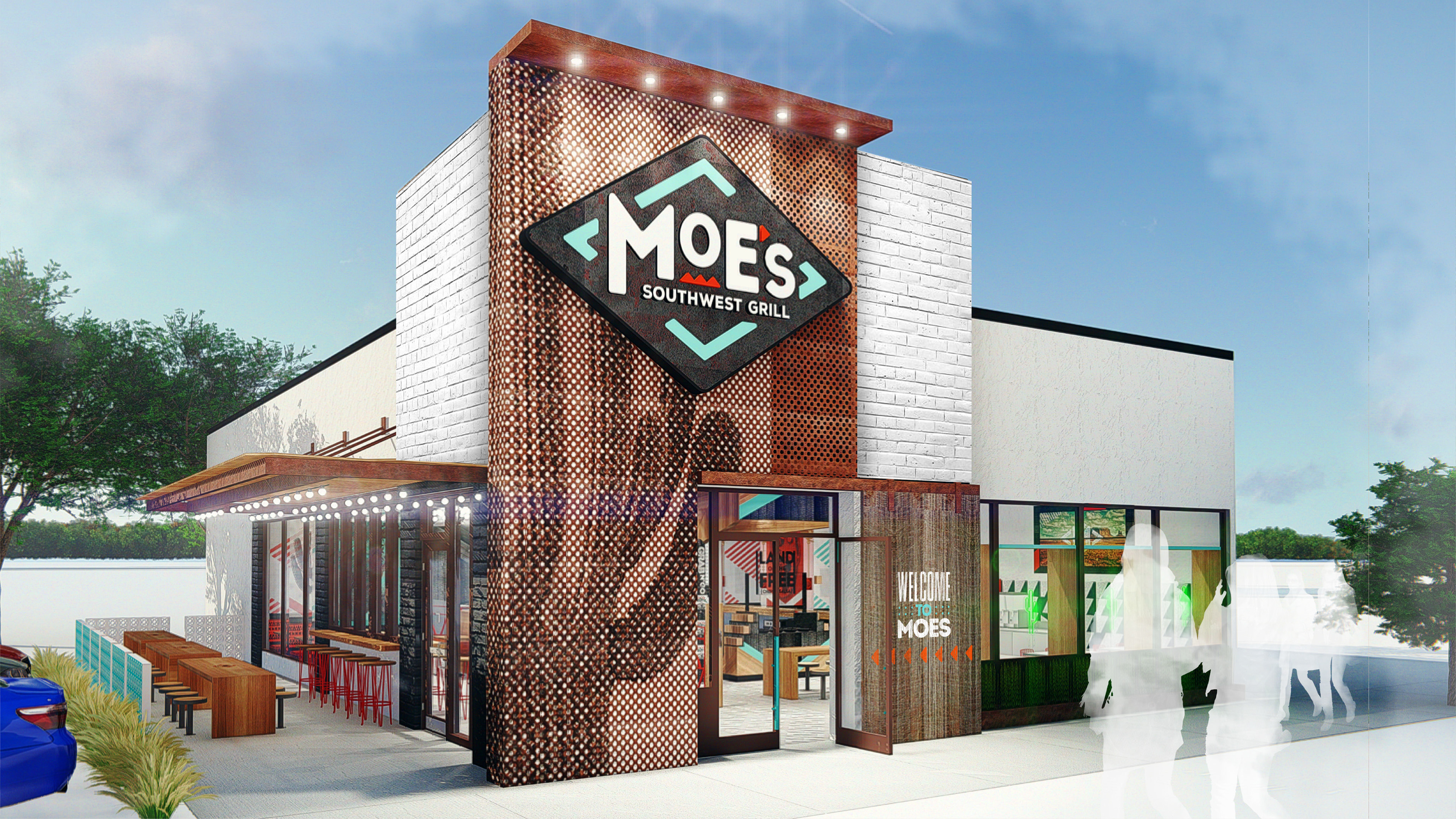
At the core of a great brand identity is a logo that inspires an entire cohesive visual system. That was my intention with the Moe’s logo. The geometry, texture, pattern, and color of the logo provided a set of tools I could use to create a dynamic and playful system that celebrated the culture and characters of the Southwest. Below is the brand character board I designed before fully extending the system to packaging and other in-store applications.
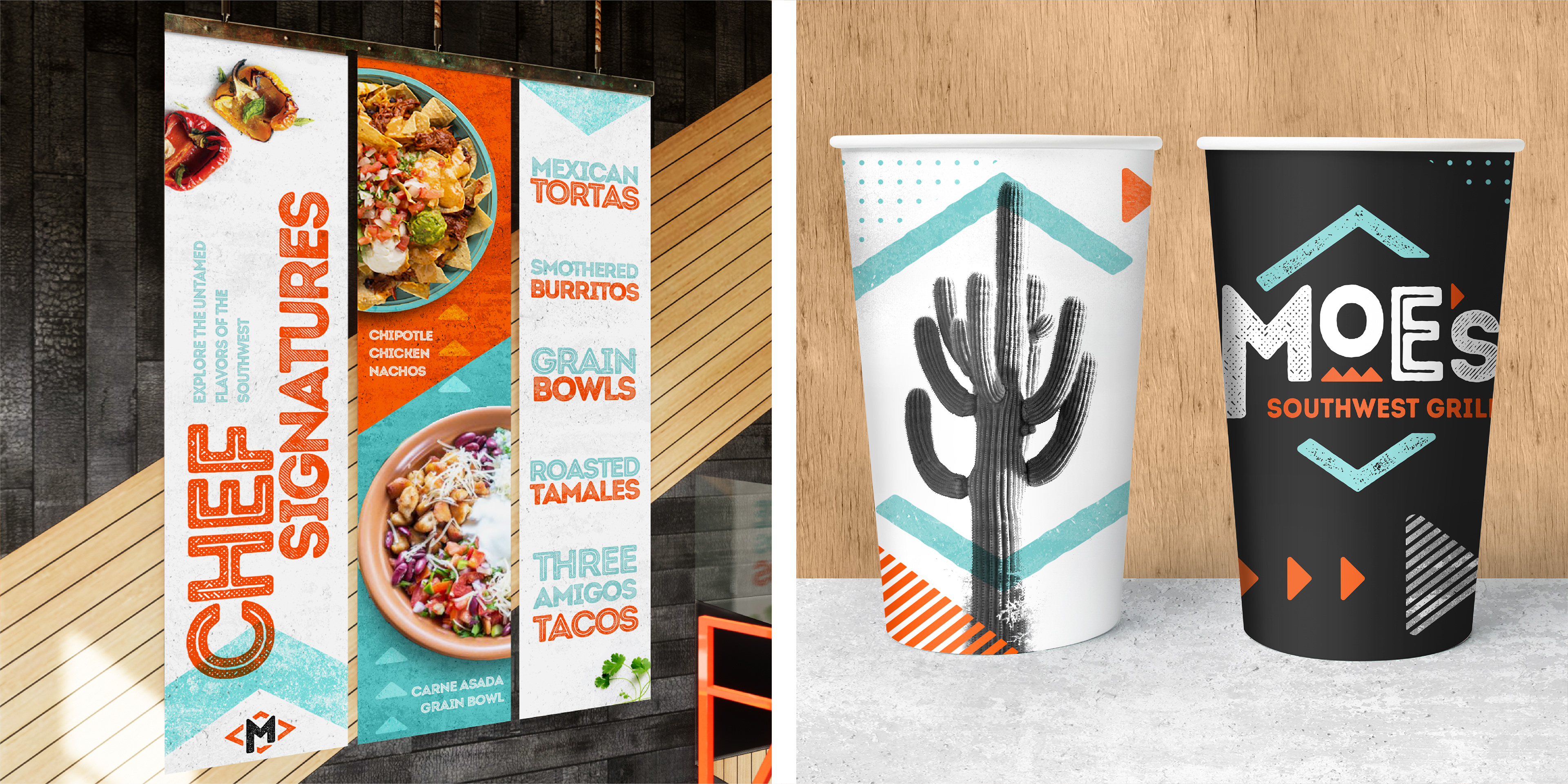
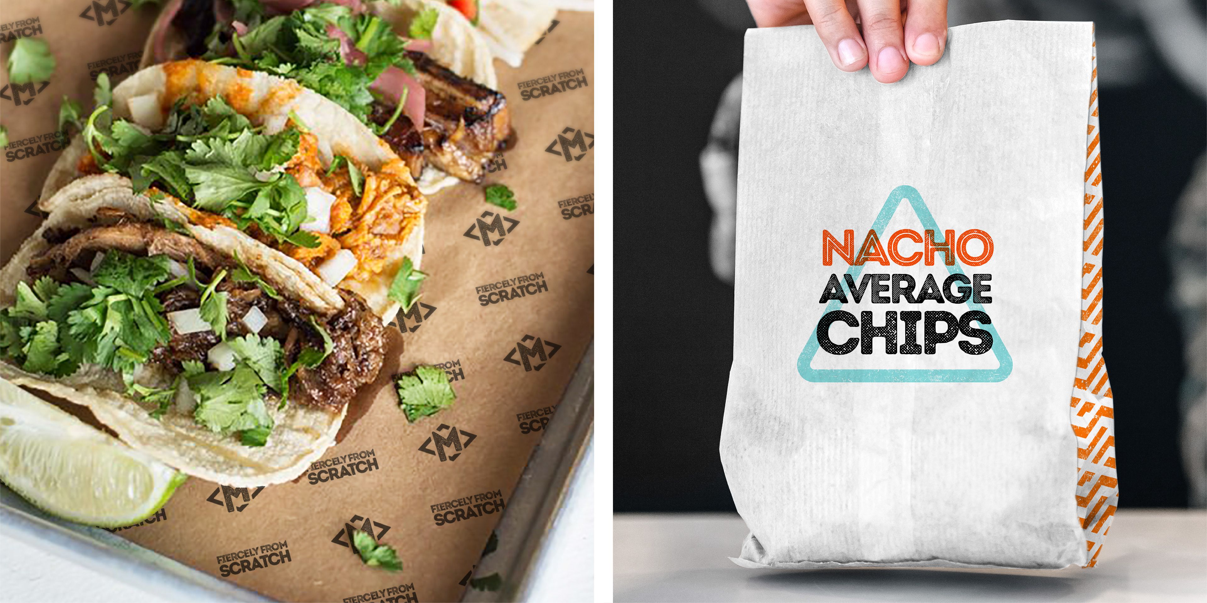

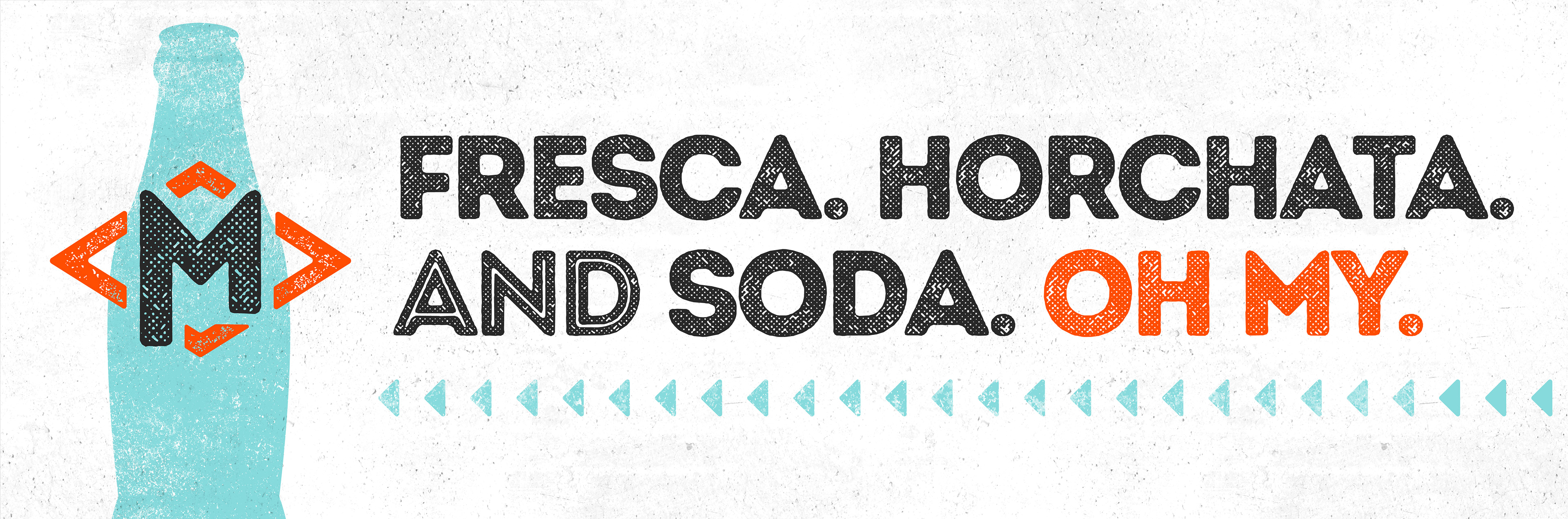
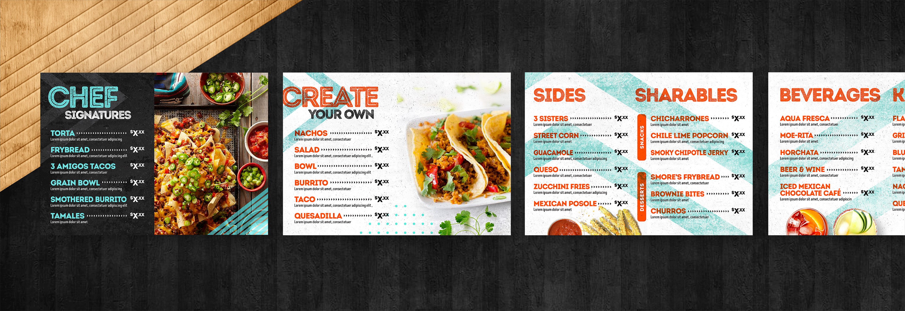
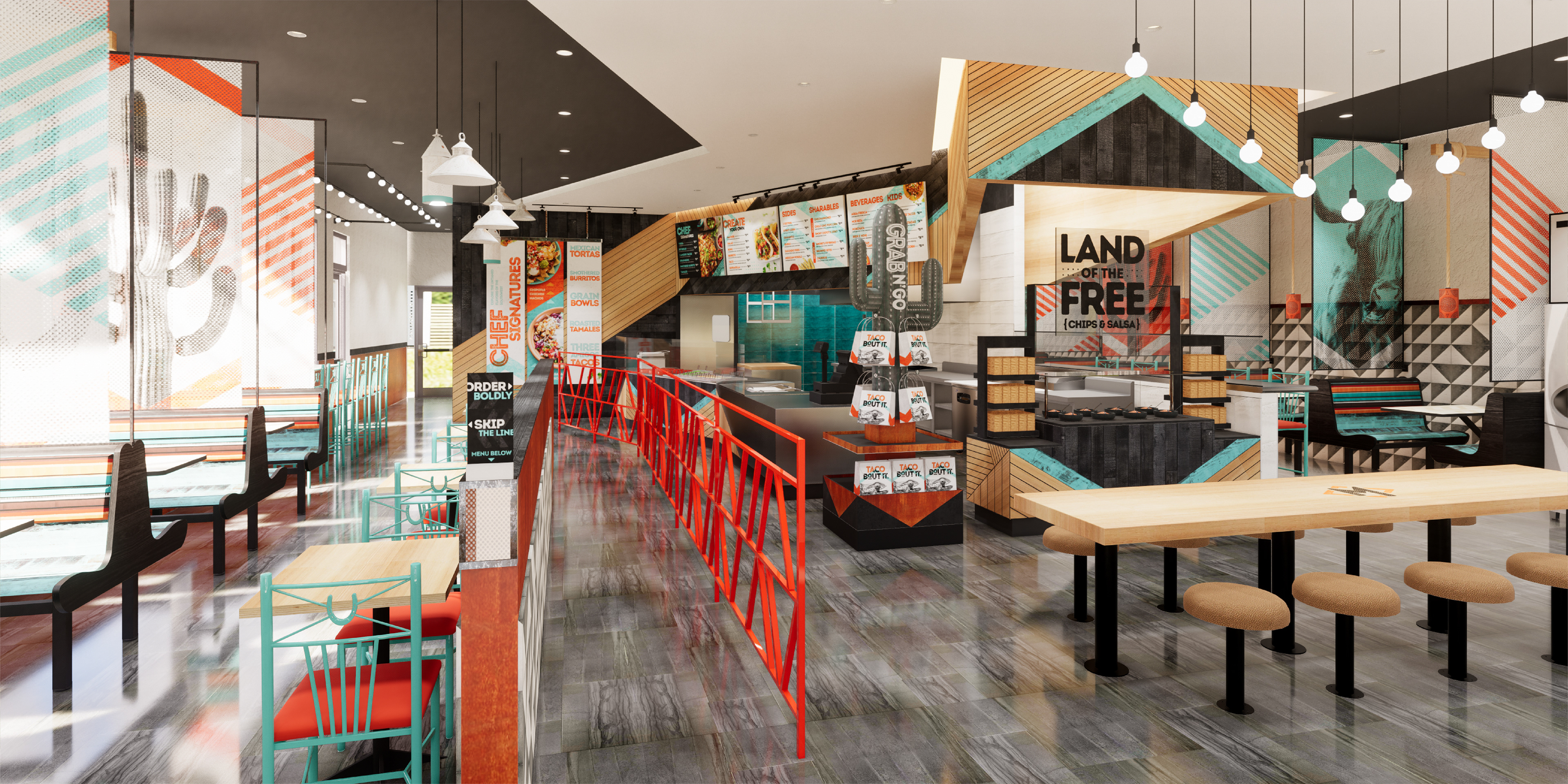
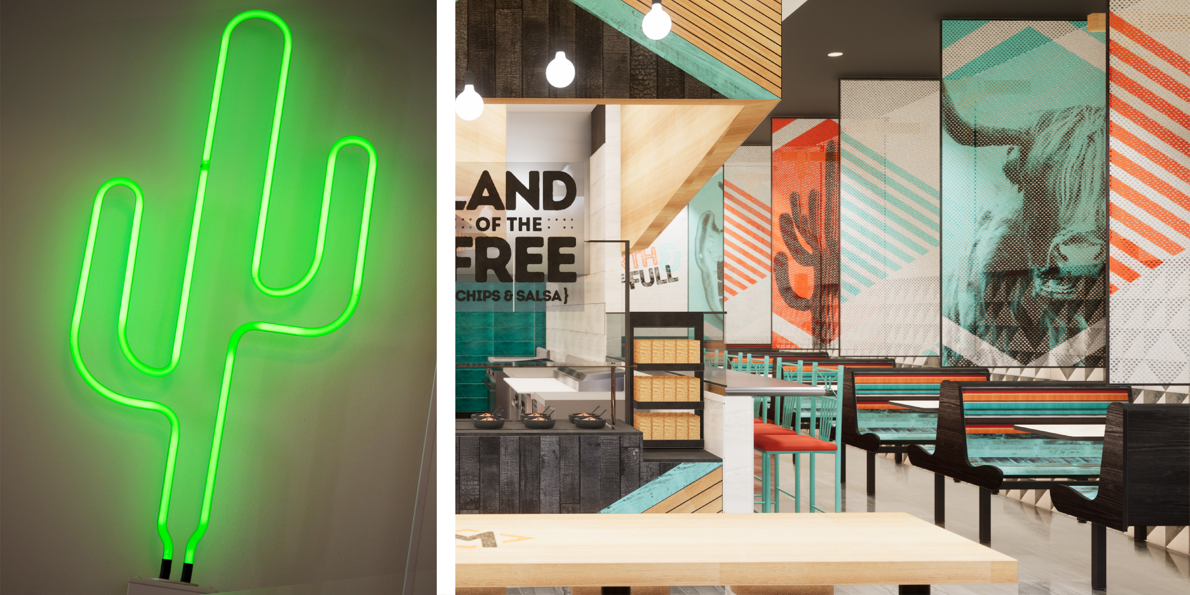
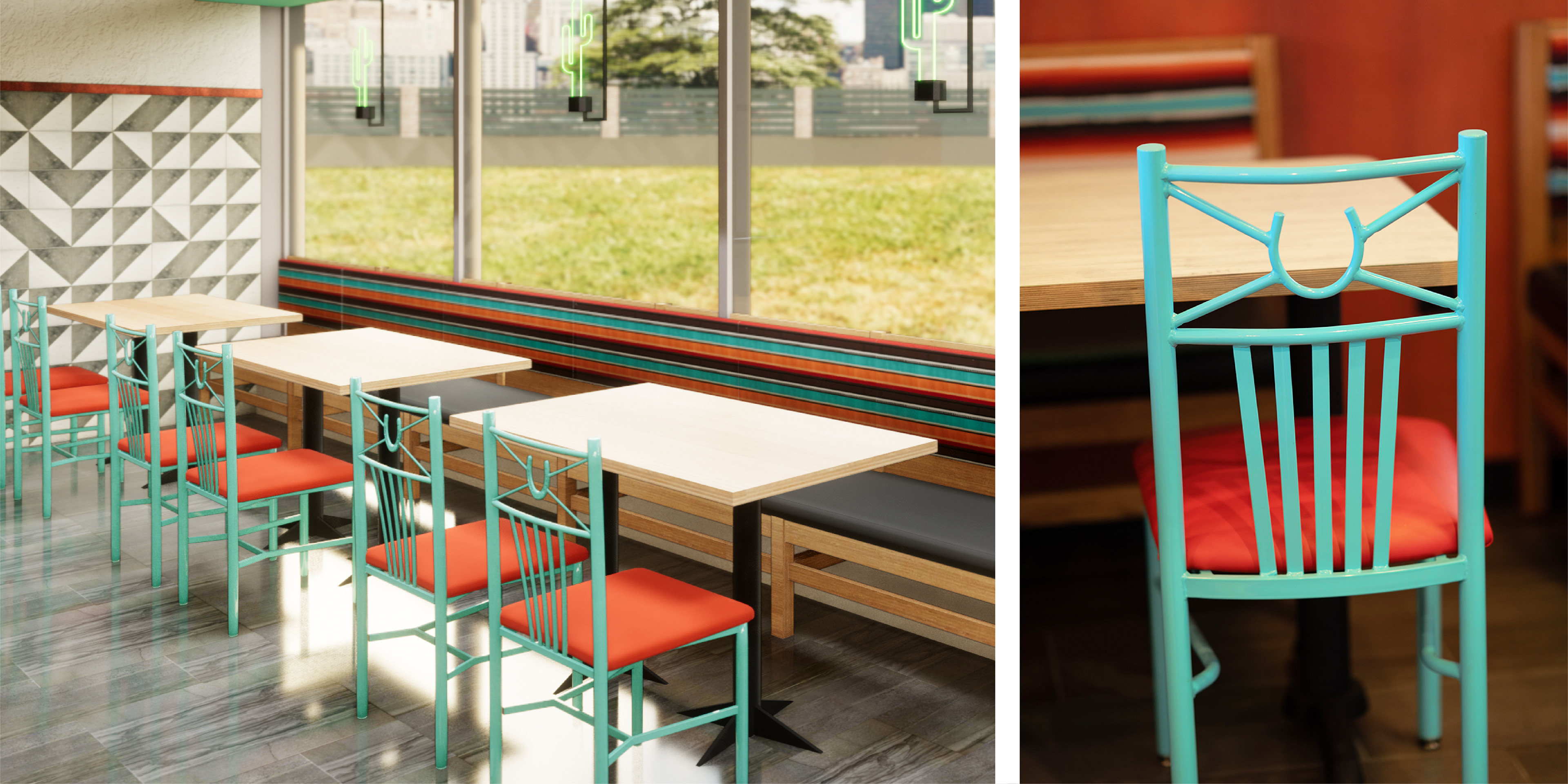
I collaborated with Lance Reed (CD) and Jeremy Kay (Director of Brand Environments) to create a completely reimagined store design experience inspired by the untamed spirit of the Southwest. We incorporated the same toolbox of geometric shapes, patterns, textures, and colors I established in the identity to connect to the brand's overall visual language.
THANKS FOR VIEWING!