
CLIENT: FOCUS BRANDS
MY ROLE: DESIGNER/ACD
CD: LANCE REED/JEN JONES
FIRM: SRG
MY ROLE: DESIGNER/ACD
CD: LANCE REED/JEN JONES
FIRM: SRG
Once an industry leader, Jamba Juice was stuck in a sugary past and was losing more and more to smaller, niche brands.
The brand needed to evolve to meet consumer demands around freshness and health. SRG stepped in to create a new future-focused brand strategy to help them reclaim their category leadership, and they needed a new identity to signal this change.
My solution shown below was selected for implementation summer of 2019.
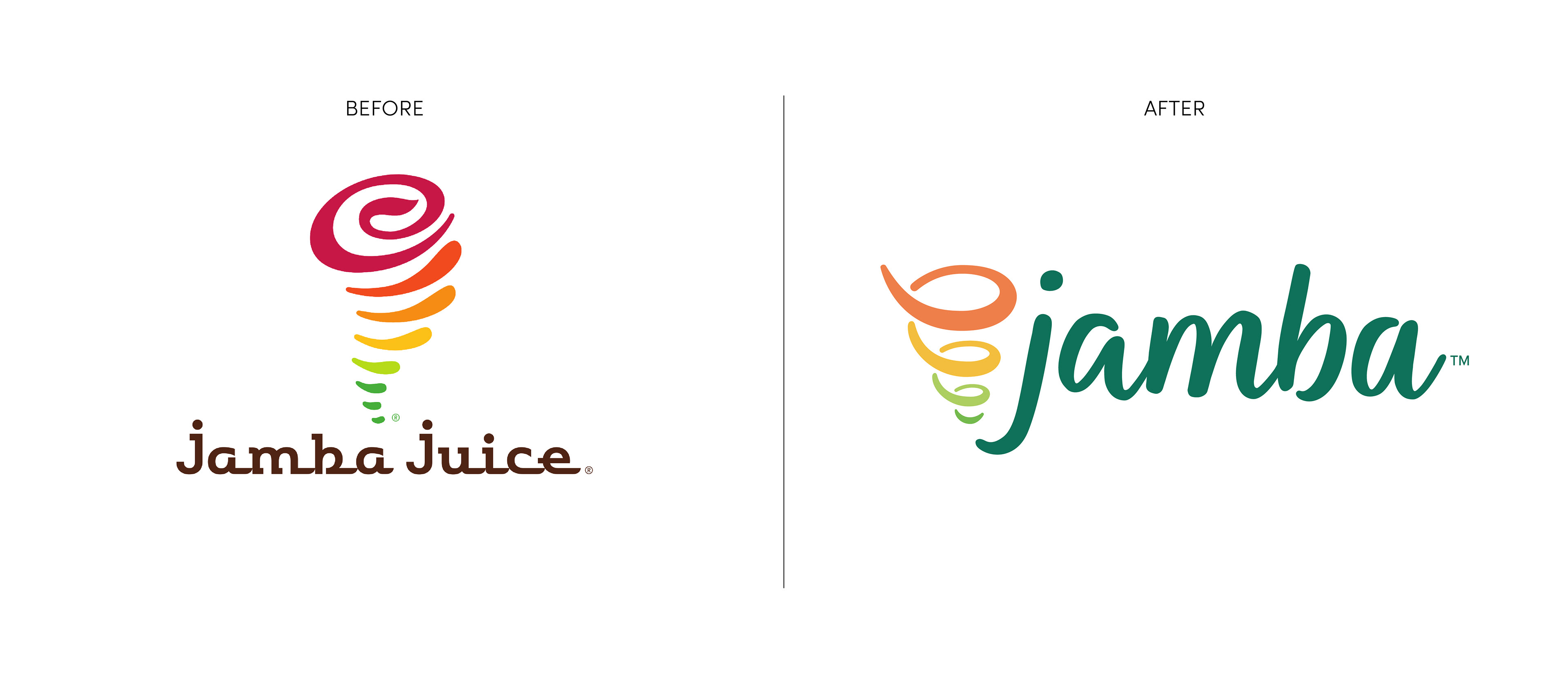
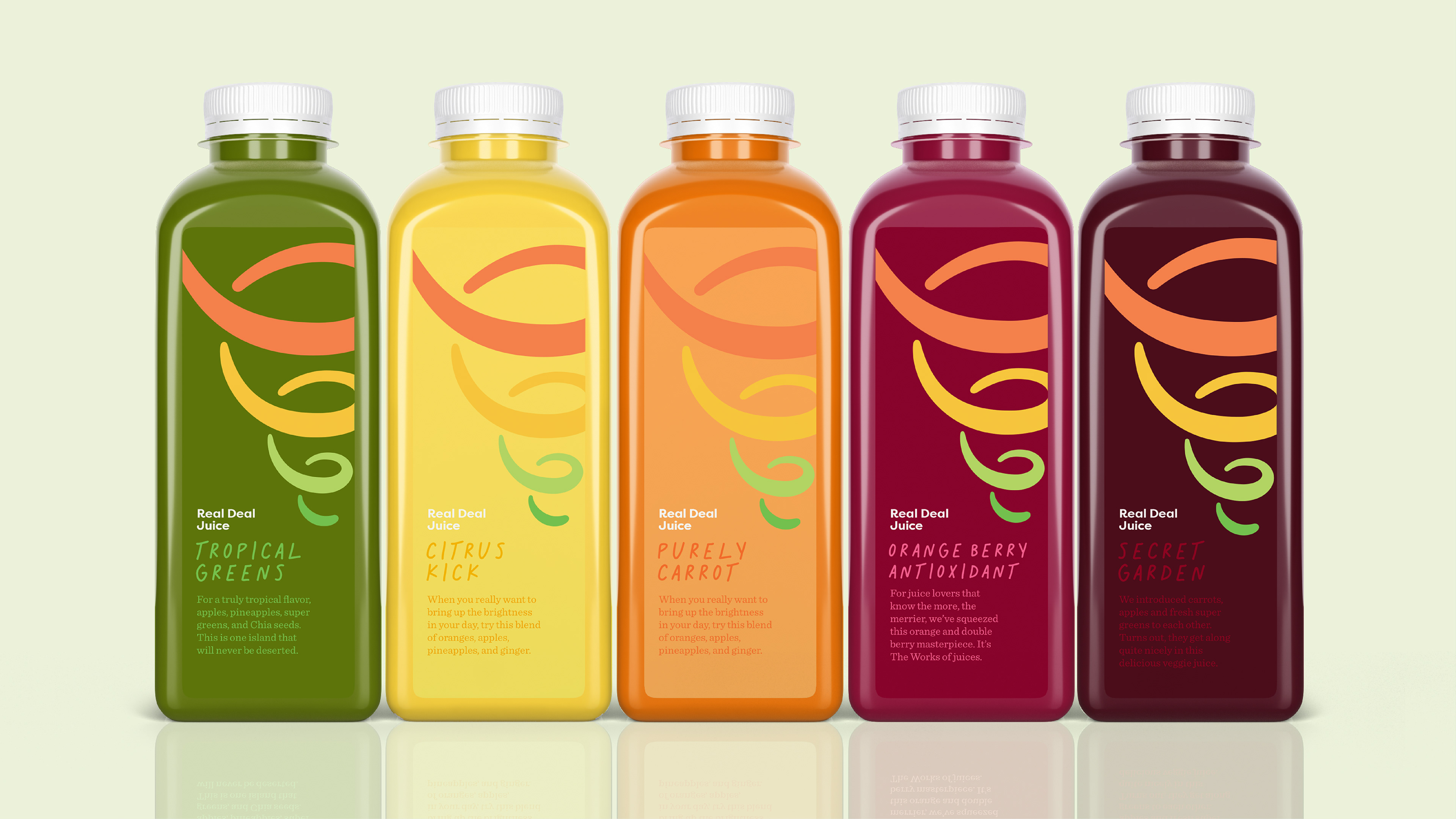
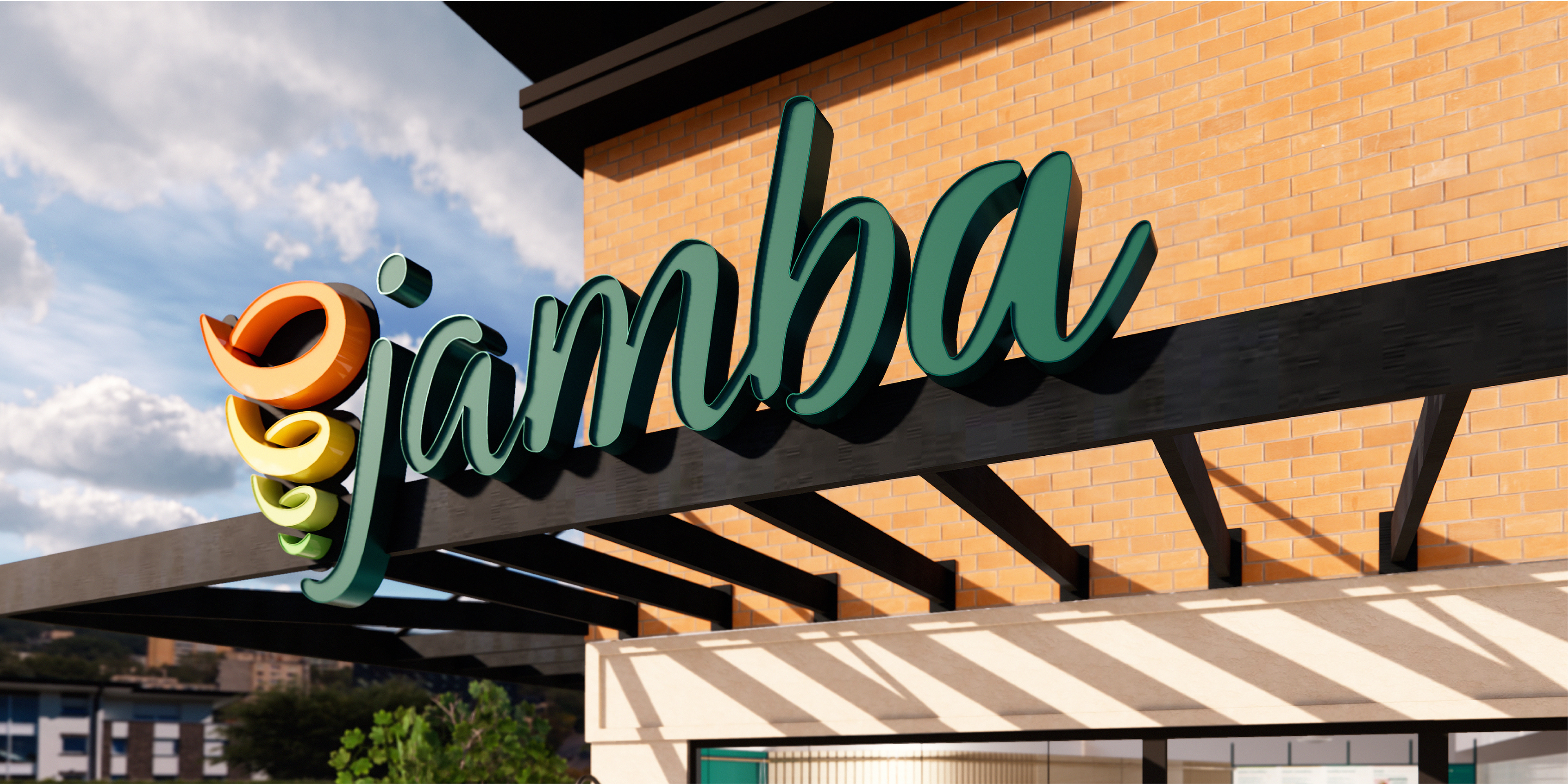
I simplified the symbol by reducing the number of tiers and gave it a dimensional quality to convey the idea of fruit spiraling in a blender. I complemented the updated symbol with a friendly, custom-drawn script. I also tightened up the color palette and grounded the brand in a fresh, healthy green versus the dark brown.
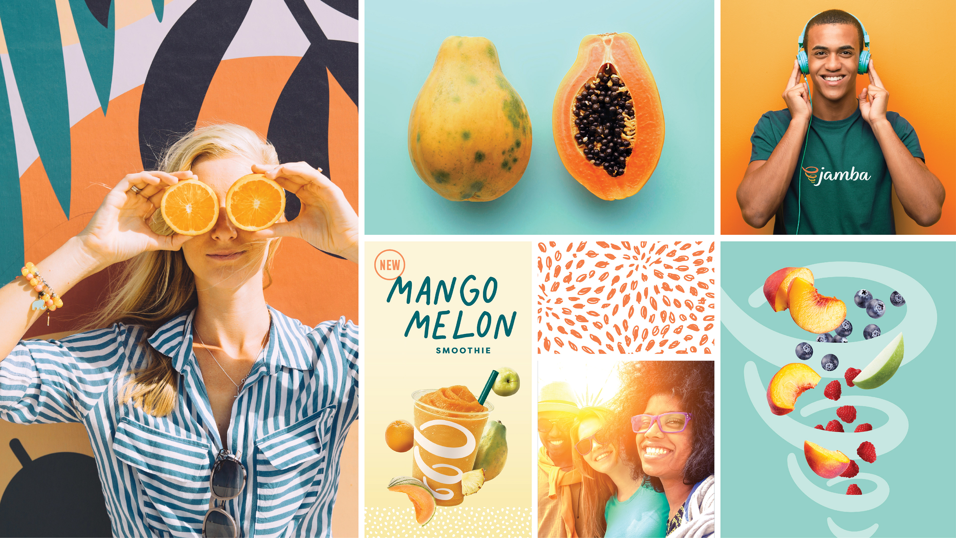
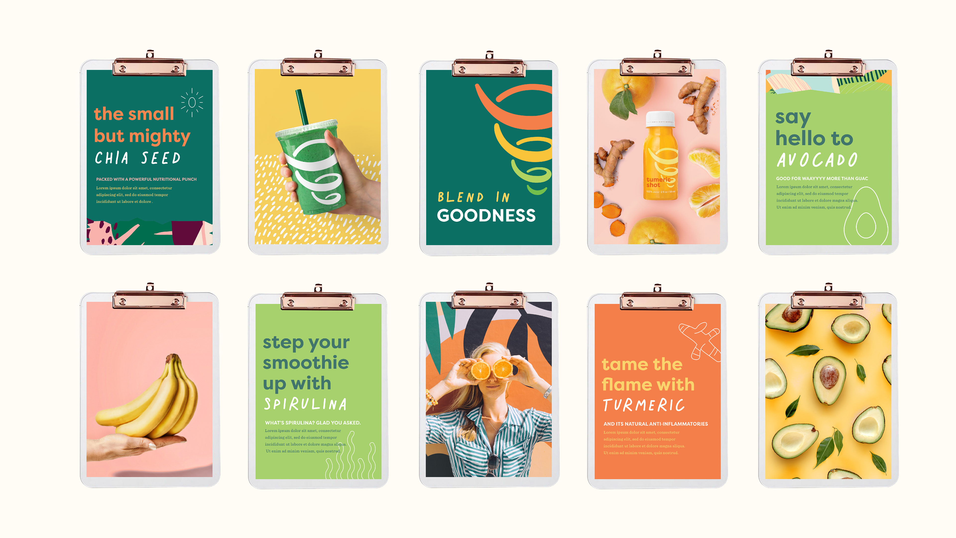
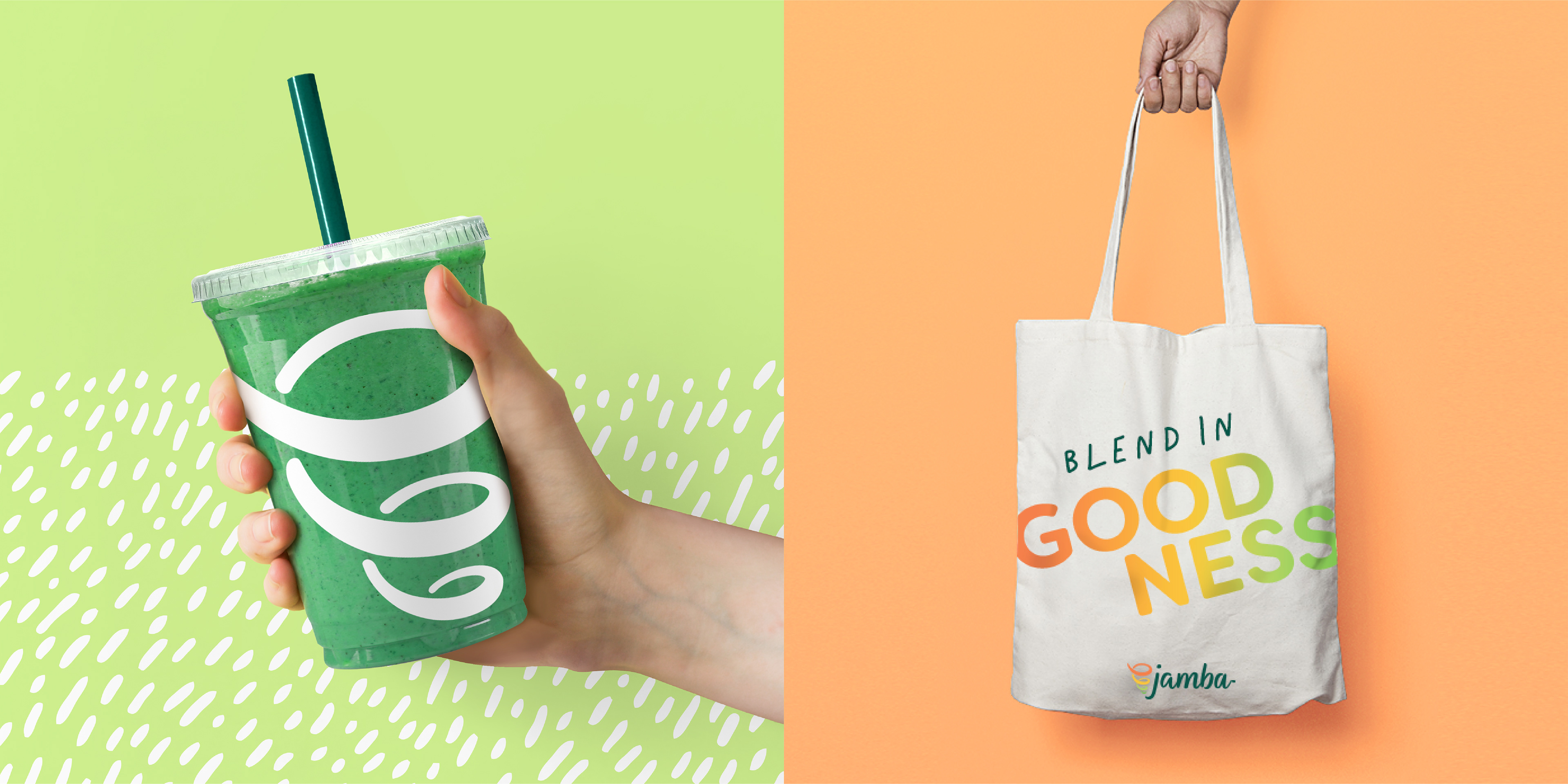
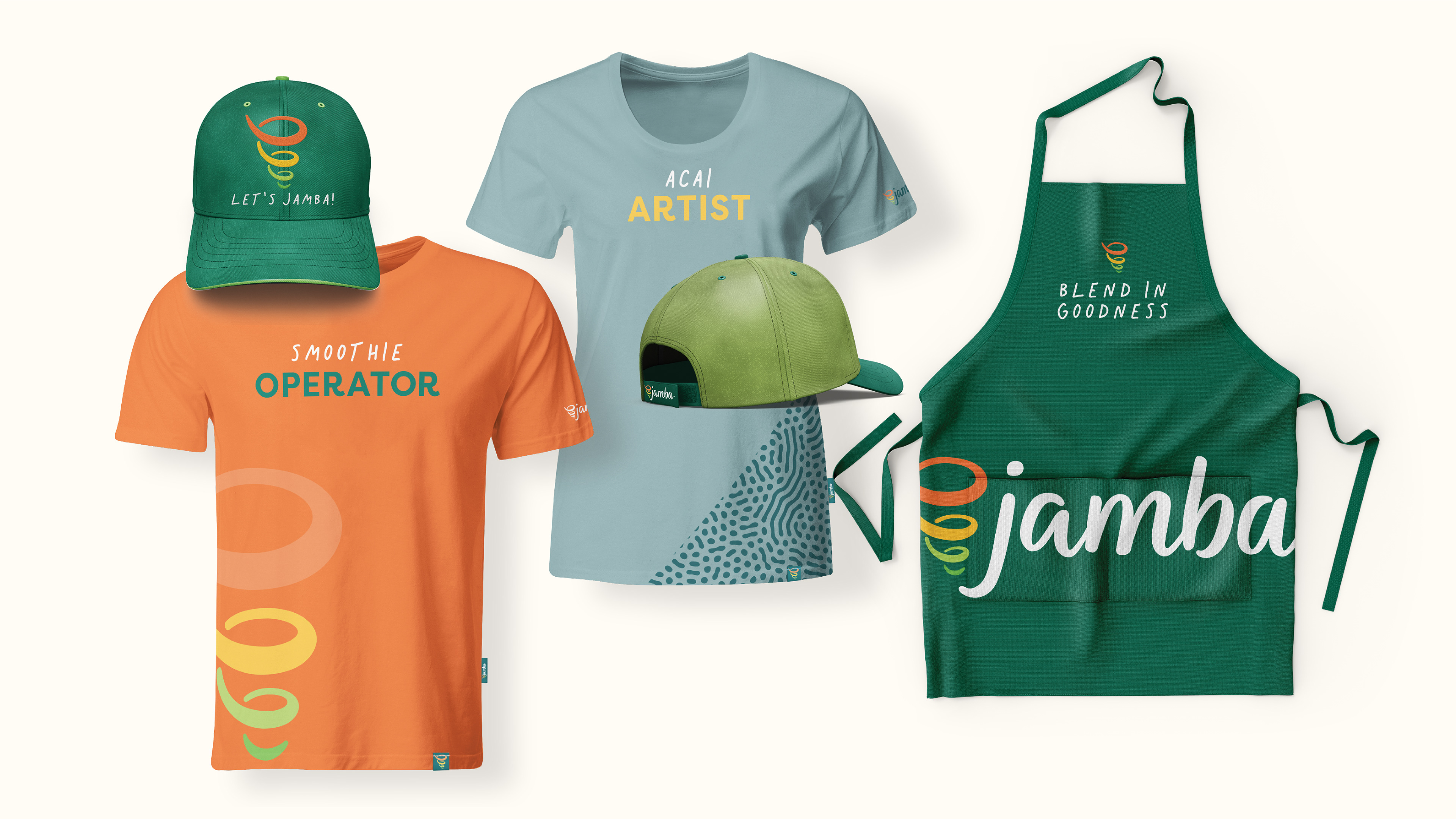
With an evolved logo, we (SRG) took a highly collaborative approach to developing the brand’s overall visual toolbox. Lance Reed (CD), Chelsea Carron (Senior Designer), Mollie Starr (Designer), and I teamed up to create a fun and fresh visual language and design assets to hand over to the internal team at Jamba for implementation.

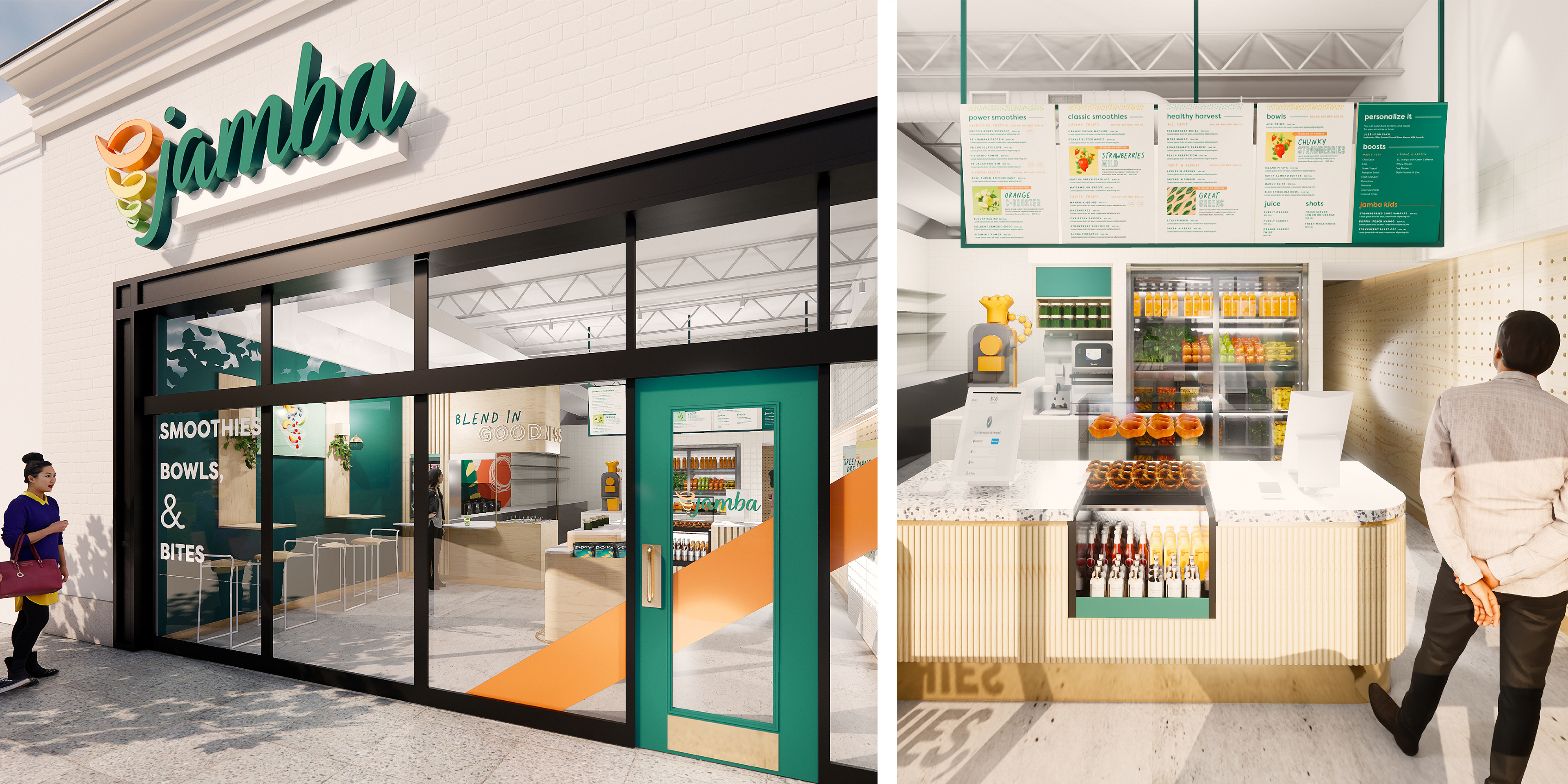
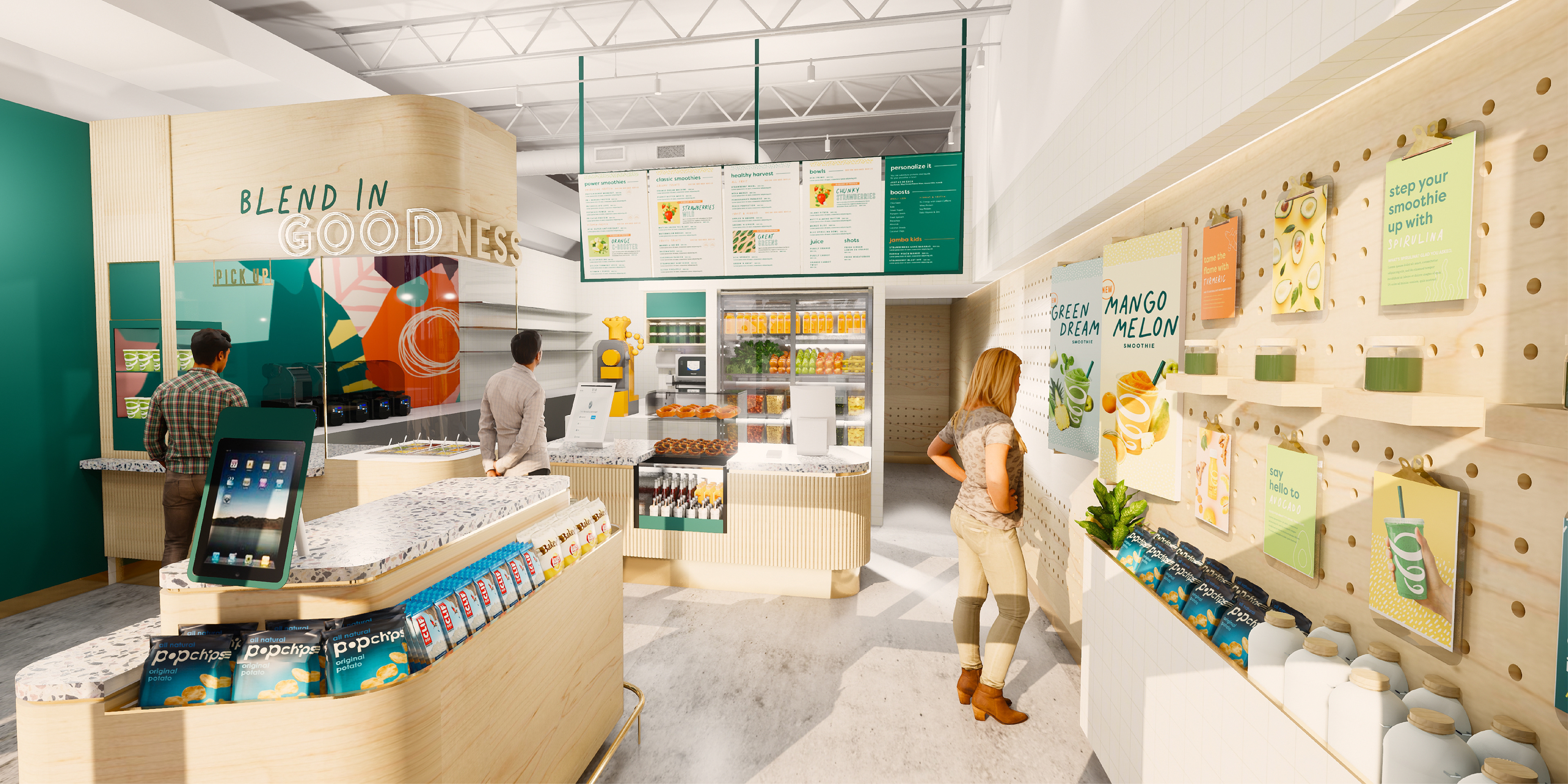
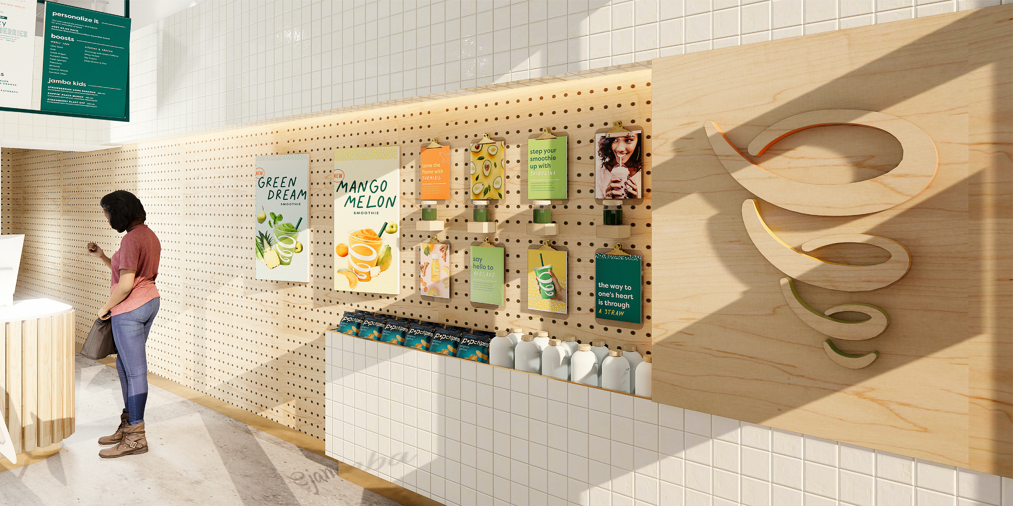
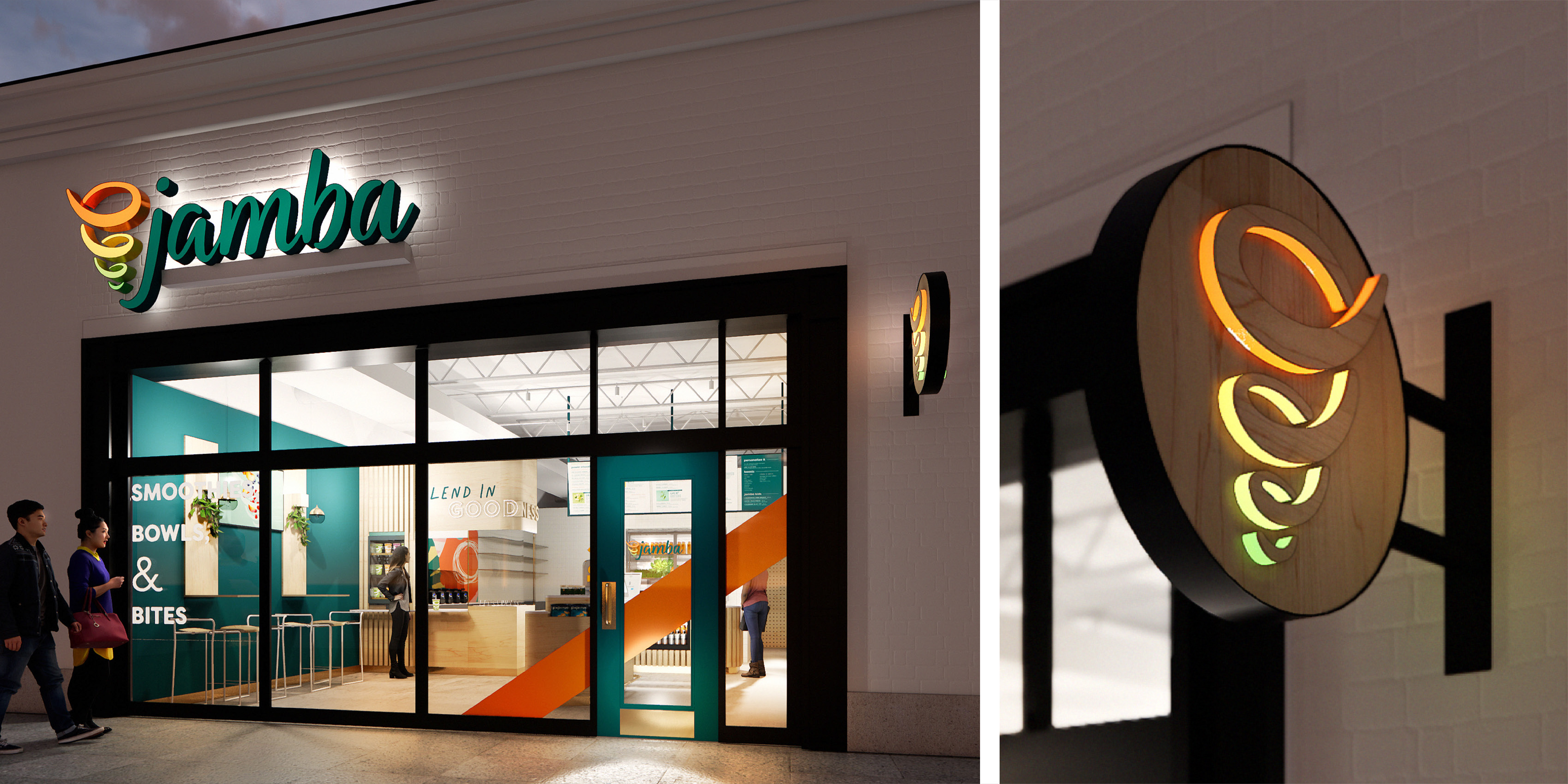
We collaborated with Jeremy Kay (Director of Brand Environments) to bring the brand to life with a reimagined store experience featuring a clipboard wall for storytelling, an updated point-of-sale with a cold case showcasing fresh ingredients, and a blender station for food theater.
THANKS FOR VIEWING!